
Tell us a little bit about your new project.
Baked with Character
Rooted in the Brecon Beacons and baked with heart, Cradoc’s is a family bakery known for doing things their own way. Our role was to help that character shine brighter — on shelf and online.
+ More Info +
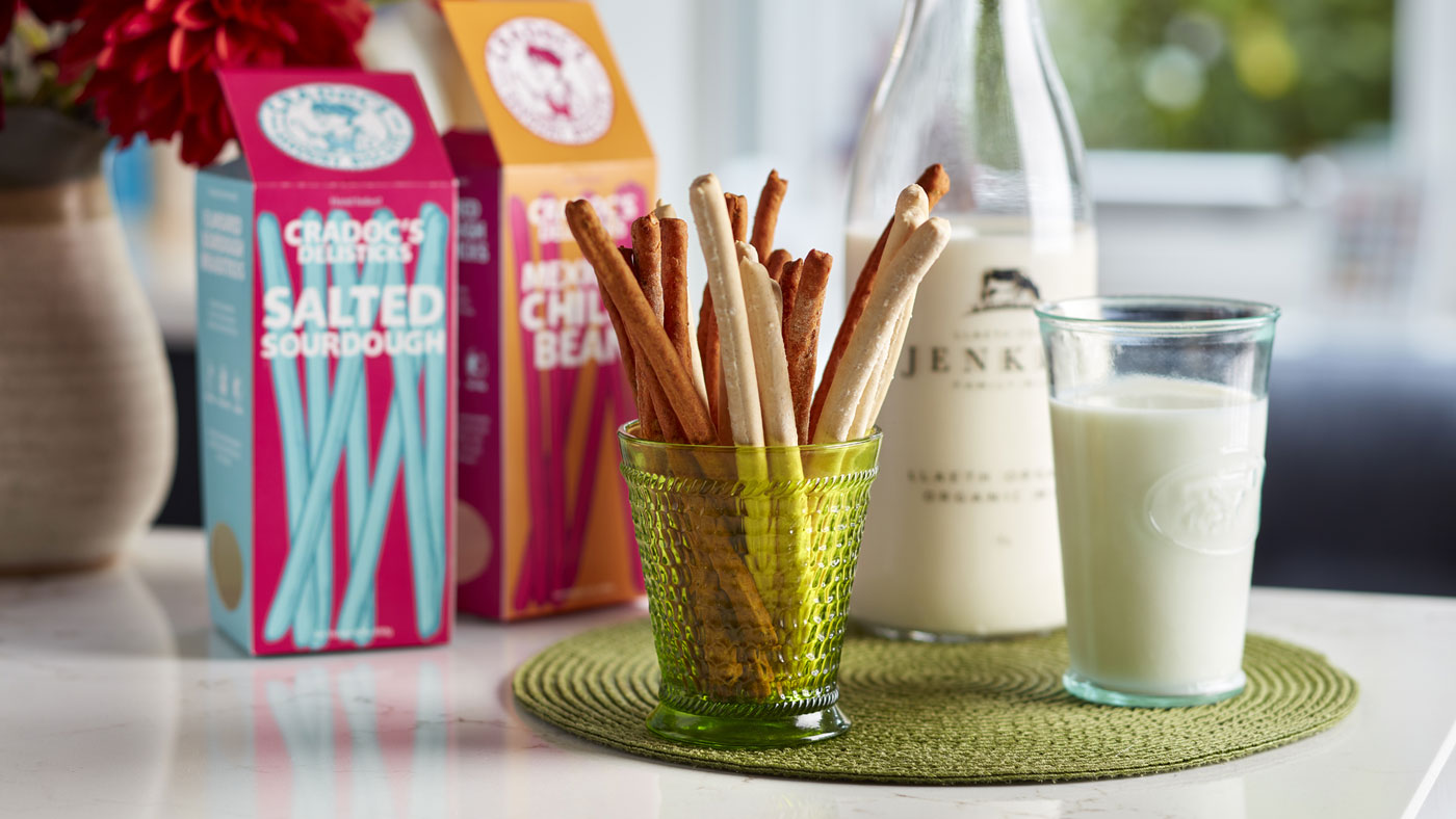
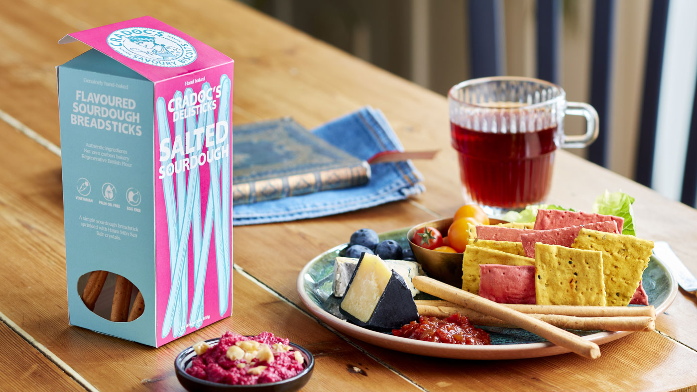
Cradoc’s has always stood out for its warmth, wit, and unmistakably human approach to baking. As the brand prepared to launch Delisticks — a new range of artisan, flavoured sourdough breadsticks — the challenge was to introduce something new while staying unmistakably Cradoc’s.
Alongside the product launch, their website needed to better reflect the brand’s personality. It had the foundations, but lacked the richness, charm, and visual storytelling that makes Cradoc’s so loved.
The vision was simple: elevate the brand without polishing away its soul.
For the Delisticks packaging, we created a design that felt confident, crafted, and full of character — building on Cradoc’s distinctive illustration style while giving the new range its own sense of presence.
Bold flavours, hand-drawn elements, and playful details work together to communicate quality without formality. The result feels artisan but approachable — just like the bakery itself.
To strengthen consistency across touchpoints, we also created a web-friendly version of Cradoc’s bespoke brand font, ensuring their unique, quirky typography translated seamlessly from pack to screen.
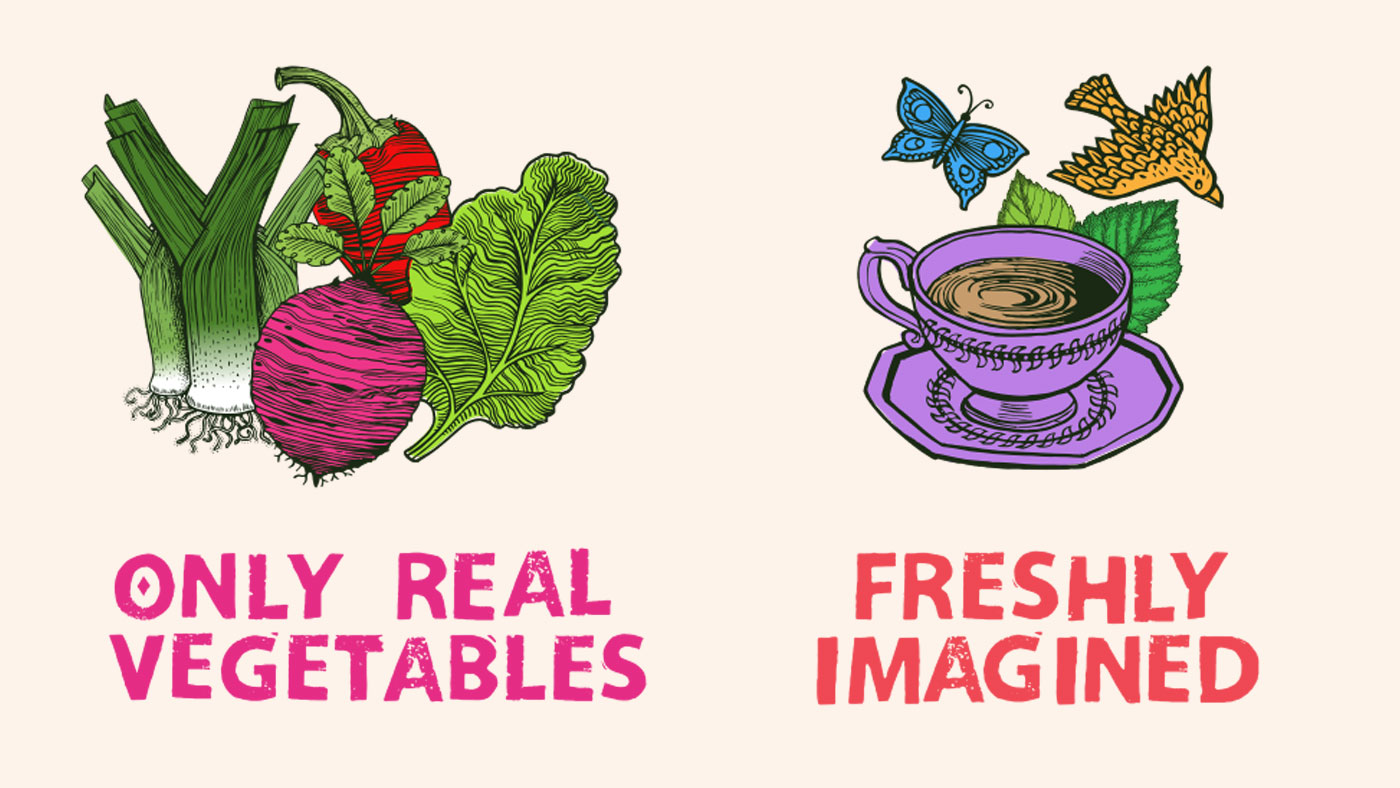
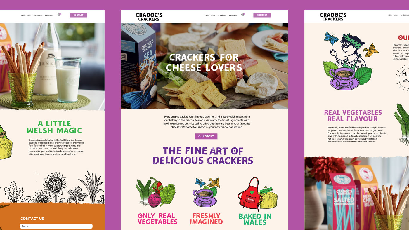
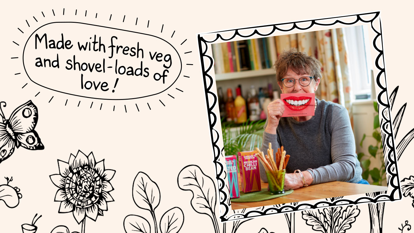
The website refresh focused on bringing the brand to life digitally. New photography adds warmth and authenticity, while brand illustrations were used more boldly and intentionally — creating moments of personality throughout the site.
We refined the tone of voice and brand copy to better reflect Cradoc’s friendly, down-to-earth nature, letting the business speak as it always has: honest, welcoming, and quietly confident.
Every illustration, word, and interaction was designed to feel personal — a digital extension of a family bakery nestled in the Brecon Beacons.
Cradoc’s Delisticks launch with packaging that feels instantly recognisable yet refreshingly new — a natural evolution of a much-loved brand.
Online, the refreshed website now feels more engaging, expressive, and unmistakably Cradoc’s. The combination of illustration, photography, typography, and tone creates a richer brand experience — one that celebrates individuality, craft, and place.
It’s a brand that doesn’t shout — but leaves a lasting impression.
Art Direction, Brand Refresh, Branding, Illustration, Packaging, Web Design
Sector: Food & Drink
Got an idea that needs some Tidy thinking? Let’s talk.
Call the studio on +44 (0) 7771 901110 or drop us an email.