
Tell us a little bit about your new project.
Same personality. Bolder attitude.
Big flavour deserves a bold personality. We helped MessyFace turn up the volume with a vibrant new packaging identity designed to stand out, spark curiosity and make every ingredient count.
+ More Info +
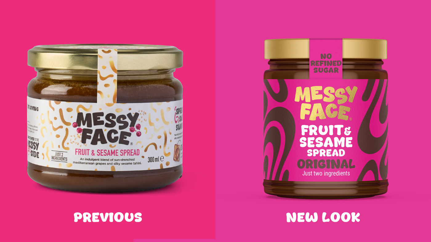
MessyFace already had a quirky name, a playful personality and a genuinely different product. But its packaging wasn’t quite delivering the impact or clarity needed to stand out. Our challenge was to build on the brand’s existing character, creating a bolder, more confident identity that celebrated its simple ingredients and made MessyFace impossible to ignore.
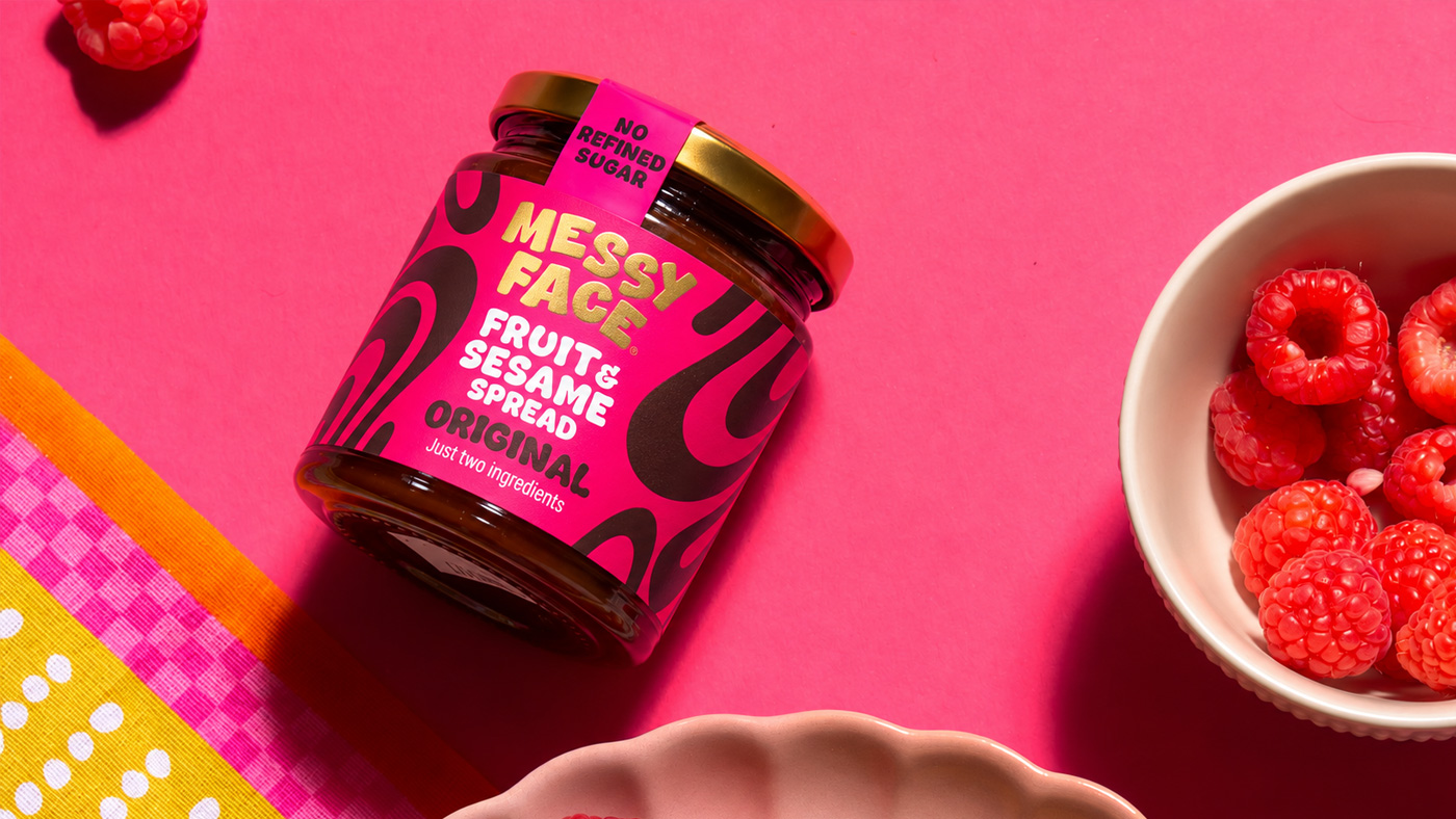
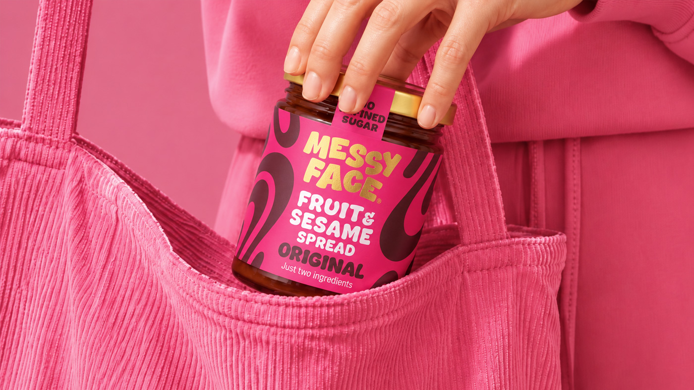
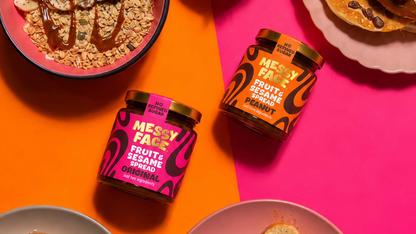
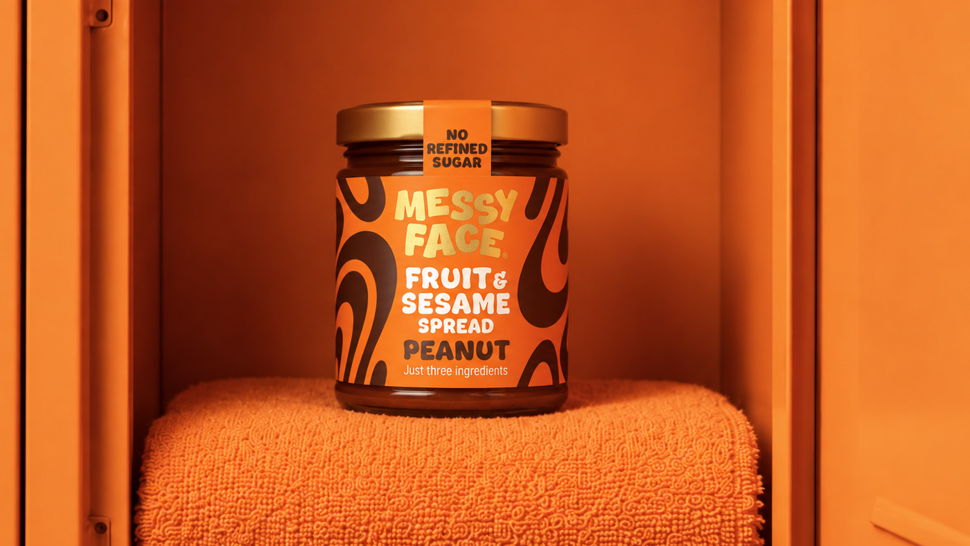
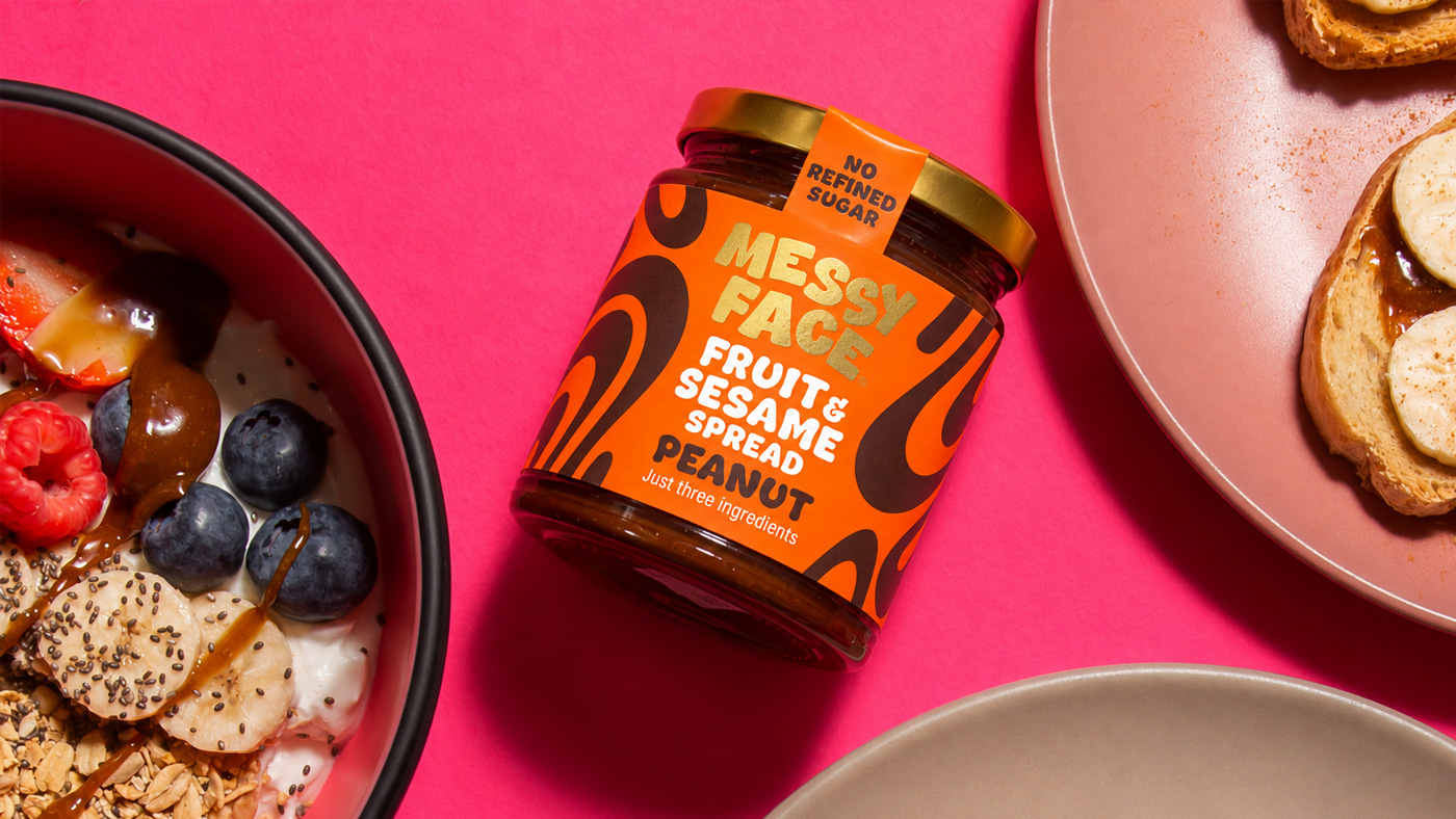
A vibrant new look that feels playful, indulgent and unmistakably MessyFace. We retained the brand’s distinctive typography and introduced bold colours and flowing graphic patterns inspired by the silky blend of grape molasses and tahini. Clearer messaging puts the product’s simple ingredients front and centre, while gold foiling and spot UV add a premium finish.
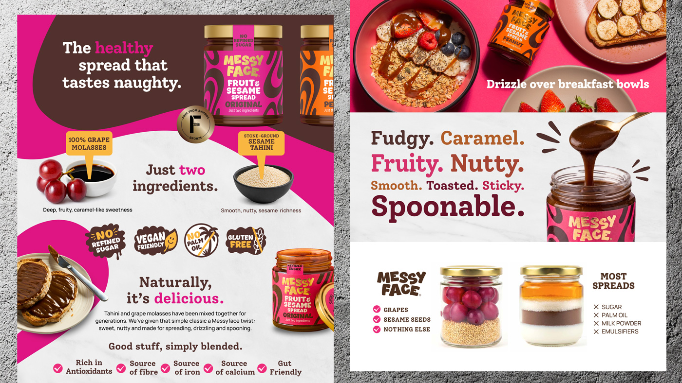
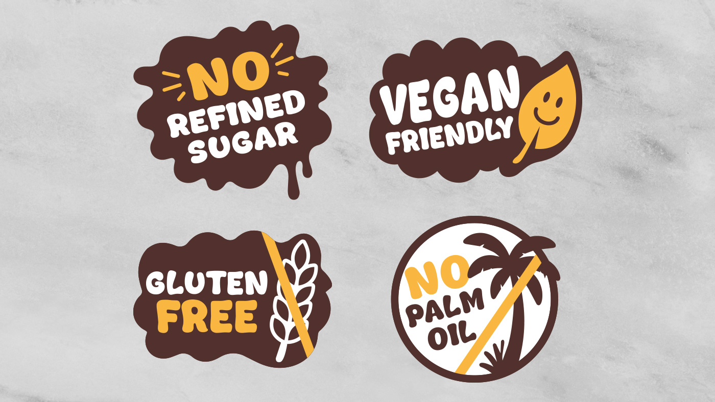
We extended the refreshed identity into a suite of Amazon A+ content, combining engaging product imagery, playful messaging and bespoke illustrated icons to create a consistent brand experience. With positive feedback already coming from customers, MessyFace now has a stronger, more distinctive presence, ready for its next chapter.
“It feels unmistakably Messyface, but with a more considered, premium finish.”
Alex Epstein
Founder, Messy Face
Amazon Content, Brand Refresh, Illustration, Packaging, Packaging Design, Web Design
Sector: Food & Drink
Got an idea that needs some Tidy thinking? Let’s talk.
Call the studio on +44 (0) 7771 901110 or drop us an email.